The Heatmap is an essential feature that allows you to quickly visualize your activity and service levels hour by hour throughout the week. Whether it's for calls, SMS, or omnichannel interactions, this tool provides a clear overview of your peak activity periods.
Thanks to this graphical representation, you can analyze your communication flows, identify the busiest times, and thus anticipate your human and technical resource needs. While the Heatmap shows patterns of successful calls, it cannot precisely predict the exact moments when recipients are most likely to answer calls. 🚀
Call analytics
- Want to access this feature? 🖥️ Head to the "Analytics" section in your Dashboard.
On the heatmap graphic, select the indicator you want to view: number of calls, incoming calls, missed calls, outgoing calls, Service Level, or wait time:
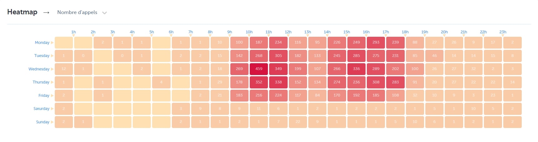
The heatmap will then display the data with an hourly 🕐 over the week
The color code means that you can identify any spikes (or drops) in the performance of your service (missed calls, service level, wait time) 📅
For outgoing calls, the Heatmap shows the number of successful calls (those answered by recipients or redirected to voicemail) by hour for your selected time period. This helps you visualize call success patterns, though it doesn't predict when recipients are most likely to answer future calls.
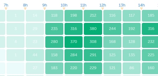
SMS message analytics
- Want to access this feature? 🖥️ Go to your Dashboard> Analytics> SMS Analytics
- Scroll down to find the 'Heatmap' chart
Note : When the color is more intense, it indicates that at that moment of the day, your users experienced a higher workload compared to other times of the day. 💡
- Select the indicator you wish to view: total SMS, incoming SMS, outgoing SMS, total fragments, incoming fragments, outgoing fragments, or SMS campaigns
The heatmap then displays the data hour by hour 🕐 throughout the week. The color code helps you identify peaks in activity and the performance of your service (unanswered SMS, SMS sent and received...). 📅
Note : When the color is more intense, it indicates that at that moment of the day, your users experienced a higher workload compared to other times of the day. 💡
Omnichannel analytics
- Want to access this feature? 🖥️ Go to the Omnichannel analytics section of your Dashboard.
On the 'Heatmap' graph, choose the indicator you want to visualize: total messages, inbound Omni-channel messages, or outbound Omni-channel messages:
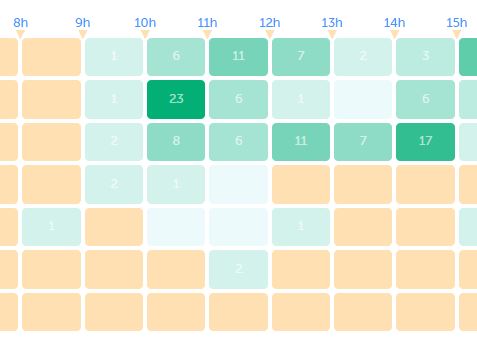
The heatmap then displays the data hour by hour 🕐 throughout the week. And the color code allows you to identify activity peaks and the performance of your service. 📅